
Black and White vs. Color
July 17, 2017 by Sharon Tenenbaum and Rick Hulbert
(Originally published at The Luminous Landscape)

City of Arts and Science Side by Side
An Educational Duet on The Search for Simplicity vs. Complexity
Sharon Tenenbaum and Rick Hulbert team up to talk about advancing your photographic talents. Hear from 2 International Award Winning Photographers 2 points of view.
SHARON TENENBAUM:
“Rick teaches how to give an objective depiction of reality whereas I am completely subjective.”
My background starts out quite nerdy; I was originally trained as a civil engineer. Later in life yet made a career change to become a fine art photographer. Having one leg in the sciences and one in the arts I feel that a can approach situations with an analytical mind yet convey them with an artistic eye. I always try and push the boundaries of my images. I demand this not just of myself but also from my students, don’t show things as they are but as you see them to be. To push the limits of conventional by creating an image that shows a scene in a way that hasn’t been shown before. This is where I find Rick complements me, as he teaches how to give an objective depiction of reality whereas I am completely subjective. Between these two extremes, the students have a wide range in which they can find their own voice.
RICK HULBERT:
“While Sharon searches for and achieves amazing fine art photographs that portray the simplicity of subject matter in her own unique way, my complementary objective is to celebrate the complexity of the Urban Environment.”
My Photography is informed by my background and experience as a professional Musician, Architect, Urban Designer, Photographer, and Educator. In order to practice Architecture successfully, one needs to respect and learn from both the arts and sciences. The same is true for Photography. While Sharon searches for and achieves amazing fine art photographs that portray the simplicity of subject matter in her own unique way, my complementary objective is to celebrate the complexity of the Urban Environment. I draw inspiration from the history of the 2-Dimensional Arts of Drawing and Painting, along with the emerging Neurosciences, the Mathematics of Linear Perspective, Physics, and Physiology. My objective in teaching is to convey a basic understanding of how beholders of fine art photography go from seeing to perceiving an image. If your objective is to want people to enjoy your images, the information we will cover in our September Chicago workshop will be of considerable value.
Color vs. Black & White
Sharon’s take:
Ever since color film was invented and became widely available, there have been debates about shooting in color vs. black and white. When I teach, I tell my students, there is no right or wrong way, it all depends on what you are trying to convey. Most of us have a subconscious aesthetic sense of which image works better in B& or color. This instinctive feeling can guide us as to why we prefer one over the other. At times we might be conflicted and not have a priority at all. As an artist and teacher, I believe that once you become fully aware of why these differences exist, it will help you as a photographer, to use them as tools to convey your vision and decide when to post process an image in color and when in black and white. However, before we even begin, we cannot have a discussion on B&W without mentioning that it is not our natural way of seeing. The human eye is conditioned to notice color and rely on color for many situations such as distinguishing one object from another.
So, from where did this notion of Black and White evolve?
Black and White art existed years ago as drawings and etchings, either minimalist or elaborate. In the world of photography, it started out as a limitation of technology. For the first dozens of years, B&W photographs were all that the world saw. This always raises the notion that our subjective preference to B&W is nostalgic. There might be a kernel of truth to that, however, our Urban Fine Art Photography Workshop will highlight a number of both subjective and objective reasons that will guide your photographic approach going forward.
Understanding Tonal Range:
Long before Fred Archer and Ansel Adams created their ‘Zone System’ that defined the range of light values from dark to light, artists have been fully aware of this concept. It was just referred to as tonal “values.” Our joint workshop will discuss how an understanding and depiction of these tonal values can be employed to convey a meaning in photography. The following diagrams provide a glimpse into the world of Tonal Values along with the Zone System.
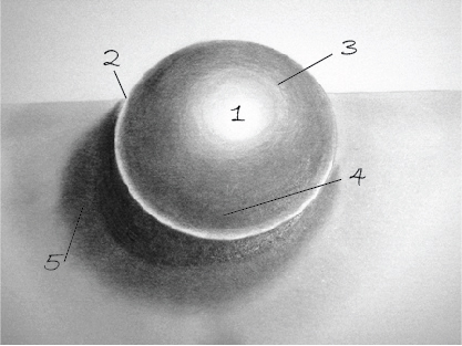

Light values marked on the sphere to illustrate the use of gradation. Images above depict the gradation of tone from black to white to depict shadow and depth. As photographers, we all know the importance of a wide tonal range. It creates a more realistic depiction of the gradation of light and shadow.

Zones. Image Above (Zone System in Photography. Note that the values just got reversed)
But what happens when we take colors and convert them to black and white? Learning to see in Black and White is not all that straightforward. The following diagram shows four different colored circles. The colors are pure blue, red, green and yellow.

However, once the image gets converted to b&w, they don’t look so appealing:

As a result, colors, when simply converted to black and white, create a narrower tonal range as seen above.
Luckily we have the aid of dodging and burning to increase the contrast and with a little help from the Photoshop gods, a nicely lit scene can be translated into a full zone black and white image. Yet, no matter how hard you try, any color will always be lighter than pure black.
Color Creates an Emotional Response:
We are first and foremost emotional beings. Almost every interaction in waking hours creates an emotional response. Paired with our strong sense of vision (we have more areas in the brain dedicated to the visual sense than all the other senses combined), the result is an emotional response to things we see of which color plays a major role. While the study of the ‘Psychology of Aesthetics’ is still in its infancy, scientists are researching how different colors impact different cultures around the world. Black and White tonal values deal with emotion through contrast. A mid-tone image is very neutral and calm, whereas a strong contrast image creates a dramatic statement.
Less is More – Art vs. Reality:
There are a number of reasons why the eye enjoys simplicity. Our workshop will discuss this in more detail but consider the following: As I personally view the creation of art, my objective is not to give an exact depiction of reality, but rather an artist’s interpretation of reality. This translates into the question of ‘what do you want to say?’ in your image. By focusing on one aspect and clearly conveying it, I believe that the viewer will not get lost in details. The details that are not relevant to the story I want to tell, are much easier to conceal in a Black and White image. Our workshop will show you how that objective can be accomplished. If I were to throw at you five apples at once, chances are, you wouldn’t catch any. However, if I were to throw just one apple at you, most likely you would catch it. The same concept applies to art; by simplifying a scene it brings home a much stronger message than a few weak ones. Taking it even further, if I were to compare imagery to literature. A highly detailed image would be compared to an elaborate novel, whereas a simplified and minimalist image to poetry. Not to say that there isn’t a time and place for each, but you should know which one you want to create.
Color vs. Black & White
Rick’s take:
Color is deceptive and almost never seen as it really or actually is. Color excels at conveying symbolism and emotion. The catch is that color generated emotion interpreted by the beholder of fine art can and does vary depending upon a variety of factors. A beholder’s interpretation of any given color is affected by its surroundings, the visual skills of the observer, and a host of other factors which will be covered during our workshop. When considering the variables of how, when, where, and by whom color is viewed, scientists have determined that there are approximately 18 Decillion colors . . . that is 18 followed by 33 zeros! While some colors are considered “primary,” plotting color in a circle has no physical rationale based on the properties of light. This is unlike music with harmonics and chords that possess mathematical relationships. The visible spectrum does not inform us as to harmonious or “complementary colors.
Black and White conveys Depth through luminance. Luminance is extremely important to how we see and perceive photography. Luminance is a subjective measure and is determined by how bright the average person judges a light to be. Black and White or Tonal Values are essentially pure luminance. The reason luminance is so important to photographers is that our perception of depth and sense of volumetric space is affected by luminance alone and is insensitive to color. While color alone can be quite compelling, color alone does not convey a sense of depth. As such, Black and White images become a powerful tool in portraying 3-Dimensional Volumetric Space on a 2-Dimensional Canvas or Screen.
What criteria do you use to decide between Color and Black & White?
SHARON TENENBAUM:
“Color conveys an emotion and sometimes I don’t always want to restrict the image to that one specific emotion”
I judge by tonal range, simplicity, and emotion. But most importantly, I like to work more in Black & White as it gives me more control over what I want to convey. Our eyes tend to be attracted to some colors more than others, which can create a subjective viewing experience that is not in my control. To have complete control of what element in the image I want to give center stage, I need to first place them on equal ground by stripping the image from color. Only then can I go back and reintroduce lighting techniques that place the various elements at different levels of importance according to how I want to lead the viewers gaze to what I want to stand out. Color conveys an emotion and sometimes I don’t always want to restrict the image to that one specific emotion.
RICK HULBERT:
“I view the subject of a photograph as the entire field of view . . . edge to edge.”
My criteria for deciding between Black & White and/or Color has to do with whether my photographic objective is to convey a realistic intent or a purposeful attempt to step back from reality with an image that is not intended as an accurate documentation of a scene. For me, the two most important aspects of my decision to consider pursuing either a Color or Black & White photographic rendition of an image respects the impact of how luminance is conveyed and how contrast is portrayed. If I can enhance the sense of 3-Dimensional depth in any given photo through luminance alone, it is a candidate for B&W.
Can you describe your photographic process and when you determine your preference for Color or B&W?
SHARON TENENBAUM:
“My photographic process starts when I am on location, I need to have a vision of where I am going with this image and what it is I want to eventually look like, which is not always clear that it will be B&W.”
However, once I’m post processing that becomes clearer. Of course, there are the no-brainers, if I’m shooting an extraordinary sunrise or sunset scene with a dance of colors in the sky, it would be a shame to lose them all. We will talk about this extensively in the workshop, how to use tools to convey your vision. Sometimes they are just two separate images that have a different voice. Just like the two images Of the City of Art and Science Colour and the one in Black and White.
RICK HULBERT:
“I enjoy the challenge in the search for and ultimate discovery of the aesthetics present in our “Perceived Reality.” For most of us, that is manifested in the illusion of color.”
Photographing Luminance values alone allows us to explore the Aesthetics of a Distorted Reality. I Achieve this objective through Black & White Processing. For me, the next further step away from reality is photographing the Invisible Spectrums of Light … especially the infrared spectrum. Rather than removing objects or elements of a scene, I enjoy the search for the beauty of the visual complexity created by the designed and constructed environment as it is affected by our ever-changing atmospheric conditions. I appreciate the portrayal of volumetric spaces designed for people and their activities. I am comfortable with allowing the viewer to imagine themselves occupying those spaces alone or sharing that experience with others present or absent from my photos.

Old Havana, Cuba

Old Havana, Cuba
Color vs. Black and White . . . You get to choose!

Vancouver, Canada

Vancouver, Canada
Sharon Tenenbaum
Sharon Tenenbaum was educated as a Civil Engineer in Israel, and practicing as a Professional Engineer in Vancouver Canada. In late 2007 she made a decision to part from engineering in order to pursue her passion... Read more.
Rick Hulbert
Rick is an international award–winning and published architect, urban designer, and photographer with a passion for teaching.... Read more.